Get Indexology® Blog updates via email.

In This List

Chasing Performance

Get a Holistic Lens on Sustainability

Forging the Global Energy Transition: An Index for Essential Metals

Surveying the Latest SPIVA India Scorecard Results

Happy Days for How Long?

Chasing Performance

Contributor Image
Craig Lazzara

Former Managing Director, Index Investment Strategy

S&P Dow Jones Indices

“…sometimes I’ve believed as many as six impossible things before breakfast.”
– The White Queen, Through the Looking Glass

Should an asset owner rely on historical performance data to select managers? The efficacy of doing so depends on the answers to three questions:

  • What fraction of the manager universe is truly gifted?
  • How gifted are they?
  • How lucky might the “ordinary” managers be?

For example: Suppose we assume that 60% of all managers are “gifted” and 40% are “ordinary,” that a gifted manager has a 75% probability of achieving above-median results, and that an ordinary manager has a 12.5% chance of doing the same. Exhibit 1 shows some implications of these assumptions for a 1000-manager universe.

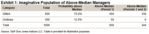
Exhibit 1 contains both good and bad news for our hypothetical asset owner. The good news is that after one period, 90% (450/500) of the above-median managers are genuinely gifted; if our assumptions are correct, hiring only from the above-median pool will lift the odds of success. The bad news is that our assumptions are almost certainly incorrect, not to say wildly unrealistic. Why? Because these assumptions imply that 69% (344/500) of period 1’s above-median managers will also be above median in period 2—a persistence rate far greater than those we actually observe. Exhibit 1 is, sadly, an artifact of wishful thinking.

If Exhibit 1’s assumptions are clearly wrong, what alternatives might be more realistic? To be more modest, we can reduce the population of gifted managers from 60% to one-third, reduce their probability of ranking above median from 75% to 60%, and narrow the gap between the gifted and the ordinary by setting the ordinary managers’ chance of being above median at 45%. As before, Exhibit 2 contains both good and bad news for our hypothetical asset owner.

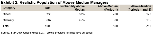
The good news is that using Exhibit 2’s assumptions, 51% (255/500) of period 1’s above-median managers should repeat that performance in period 2. Although we don’t often see results that good, 51% persistence is not unheard of, and so Exhibit 2 is at least a somewhat plausible model of reality.

The bad news in Exhibit 2 is that only 40% (200/500) of period 1’s above-median managers are genuinely gifted; 60% of them got there through luck rather than skill. And perhaps worse news: only 47% (120/255) of the managers who are above median in two consecutive periods are genuinely gifted. In other words, an asset owner who hires from the above-median pool is more likely to get an ordinary manager than a gifted one. Even if we assume that genuinely gifted managers exist—and that they stay gifted over time—hiring an above-median performer provides a less-than-even chance of finding the gifted manager we are seeking.

Active management is difficult, as readers of our SPIVA Scorecards know well; identifying outstanding managers is perhaps equally challenging. Relying on historical performance rankings is unlikely to be helpful.

The posts on this blog are opinions, not advice. Please read our Disclaimers.

Get a Holistic Lens on Sustainability

Make more informed sustainability decisions with deeper data – our indices are powered by analytics from the world-renowned S&P Global Corporate Sustainability Assessment.

The posts on this blog are opinions, not advice. Please read our Disclaimers.

Forging the Global Energy Transition: An Index for Essential Metals

Look inside the S&P Global Essential Metals Producers Index, a pure-play index that tracks the companies helping the world forge the future of energy innovation.

The posts on this blog are opinions, not advice. Please read our Disclaimers.

Surveying the Latest SPIVA India Scorecard Results

Were active and fixed income fund managers able to keep up with their benchmarks in the latest SPIVA India Scorecard? Dive into the latest results with S&P DJI’s Bhavna Sadarangani and Benedek Vörös.

The posts on this blog are opinions, not advice. Please read our Disclaimers.

Happy Days for How Long?

Contributor Image
Anu Ganti

U.S. Head of Index Investment Strategy

S&P Dow Jones Indices

With less than a month left to go to close out the year, it’s a good time to reflect on the highs and lows that market participants have experienced. While the year began with a rocky start due to the Silicon Valley Bank collapse, the market continued to power forward, stumbling in Q3 as 10-year Treasury yields rose to a 15-year high, but recovering with a bang in November, with the S&P 500® up 21% YTD.1 One consequence of rising Treasury yields was the surge in the U.S. dollar, which typically is a currency headwind for mega caps, as U.S. multi-nationals tend to gain most of their revenue from overseas. But that didn’t hamper the tear that mega caps were on this year, as Exhibit 1 illustrates, with the S&P 500 Top 50 outpacing the S&P 600® by 28% YTD. While we recently saw a pullback in 10-year yields along with the dollar, with the S&P U.S. Dollar Futures Index down 2% in November, if that trend continues, that could potentially be a further benefit to mega-cap strength.

While small caps recovered in November, this year’s large-cap-led rally has been unusual in terms of its narrow breadth. We can visualize this in Exhibit 2, where we rank the historical annual S&P 500 returns in our database by skewness of constituent returns, as measured by the difference between the average versus median constituent return, and subsequently divide them into quartiles. Then we perform the same exercise, now ranking by skewness of constituents’ return contribution. So far this year, the average return has been greater than the median by 3.5%, in between the third and fourth quartile, while the average constituent contribution has been greater than the median by 3.7%, placed right below the fourth quartile level. These relatively extreme results are consistent with the concentration of outperformance within the Magnificent Seven stocks, which has been unusually high relative to history, and perhaps a headwind for more concentrated active managers that are underweight the largest stocks.

Returning to the ascent of 10-year Treasury yields, the rise was not limited to the long end of the curve, with a significant climb in short-term Treasury yields on the back of Fed rate hikes to combat inflation. But as 10-year yields picked up steam, the inverted yield curve began to disinvert. At a sector level, Exhibit 3 shows that the momentum in Information Technology has continued despite the sector’s traditional sensitivity to higher rates, while Utilities, traditionally more bond-like in nature, is unsurprisingly the worst sectoral performer YTD. What is surprising is that while Financials should benefit from the disinversion of the yield curve, which can improve banks’ net interest margins, the sector has not managed to fully recover post the Silicon Valley Bank tumult.

In addition to spectacular equity performance, we witnessed a strong recovery in fixed income compared to last year’s abysmal performance, with the iBoxx Liquid Investment Grade up 8% in November, its best monthly return since December 2008. But while absolute performance has been rosy, risk-adjusted performance can be more challenging given continued positive correlations between equities and bonds, a natural outcome of gains across both asset classes. Meanwhile, despite China’s economic and real estate woes, with the S&P China 500 down 14% in USD terms year-to-date, Asian markets offered some solace, as we see in Exhibit 4, where a consistent negative spread in trailing 12-month volatility between the S&P Global BMI and S&P Global ex-Pan Asia BMI indicates Pan Asia has acted as a diversifier.

Putting risk into context, despite geopolitical tensions coupled with lingering inflation and recession concerns, Exhibit 5 shows that the market has been at ease, with the VIX® trending downward in the past 12 months, ending November below the 13 handle. But what signal has low equity implied volatility given for future equity returns historically? We rank the same years in our database by VIX and divide them into three buckets based on a VIX level at year-end of less than 13, between 13 and 20, and above 20. Historically, we see a linear relationship between the year-end level of VIX and median subsequent year S&P 500 returns, indicating that, on average, years ending with higher implied volatility tended to be followed by higher returns.

While predicting the future has proven to be a futile exercise, if VIX continues to maintain its standing in the lowest equity implied volatility bucket, a pullback from this year’s extraordinary market performance would not be shocking.

1 YTD as of Dec. 5, 2023.


The posts on this blog are opinions, not advice. Please read our Disclaimers.