
Look inside the S&P Global Essential Metals Producers Index, a pure-play index that tracks the companies helping the world forge the future of energy innovation.
The posts on this blog are opinions, not advice. Please read our Disclaimers.
Forging the Global Energy Transition: An Index for Essential Metals
Surveying the Latest SPIVA India Scorecard Results
Happy Days for How Long?
Tracking Thematics: How Indexing Megatrends Works
Who’s Naughty and Nice
Forging the Global Energy Transition: An Index for Essential Metals
Surveying the Latest SPIVA India Scorecard Results
- Categories Equities, Fixed Income
- Tags Active vs. Passive, Benedek Voros, Bhavna Sadarangani, IIS, indexing, indexing India, India, Indian Composite Bond Funds, Indian ELSS Funds, Indian Government Bond Funds, institutional investor, S&P BSE 100, S&P BSE 200, s&p indices versus active, SPIVA, SPIVA India Mid-Year 2023
Were active and fixed income fund managers able to keep up with their benchmarks in the latest SPIVA India Scorecard? Dive into the latest results with S&P DJI’s Bhavna Sadarangani and Benedek Vörös.
The posts on this blog are opinions, not advice. Please read our Disclaimers.Happy Days for How Long?

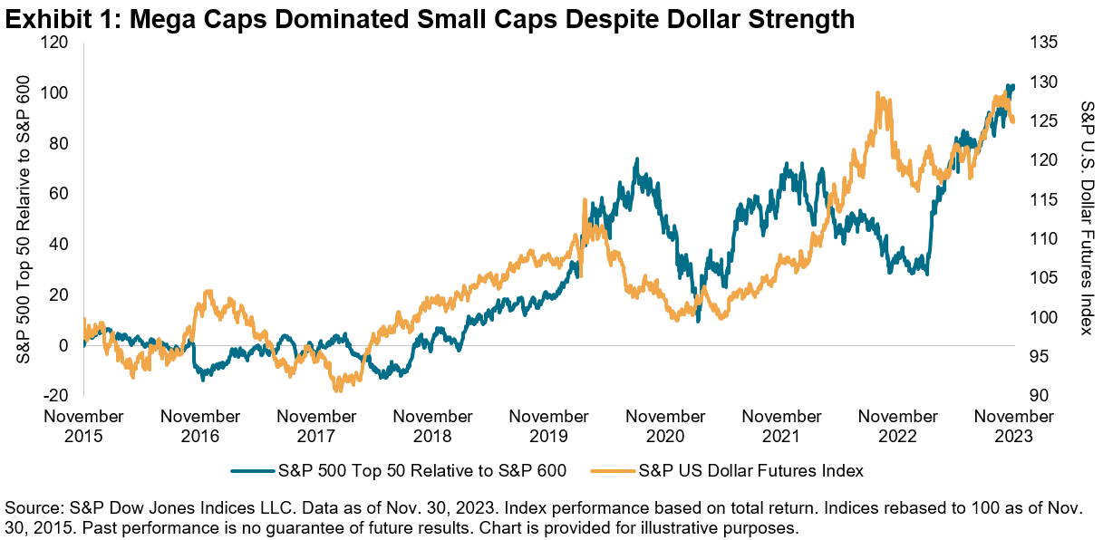
With less than a month left to go to close out the year, it’s a good time to reflect on the highs and lows that market participants have experienced. While the year began with a rocky start due to the Silicon Valley Bank collapse, the market continued to power forward, stumbling in Q3 as 10-year Treasury yields rose to a 15-year high, but recovering with a bang in November, with the S&P 500® up 21% YTD.1 One consequence of rising Treasury yields was the surge in the U.S. dollar, which typically is a currency headwind for mega caps, as U.S. multi-nationals tend to gain most of their revenue from overseas. But that didn’t hamper the tear that mega caps were on this year, as Exhibit 1 illustrates, with the S&P 500 Top 50 outpacing the S&P 600® by 28% YTD. While we recently saw a pullback in 10-year yields along with the dollar, with the S&P U.S. Dollar Futures Index down 2% in November, if that trend continues, that could potentially be a further benefit to mega-cap strength.
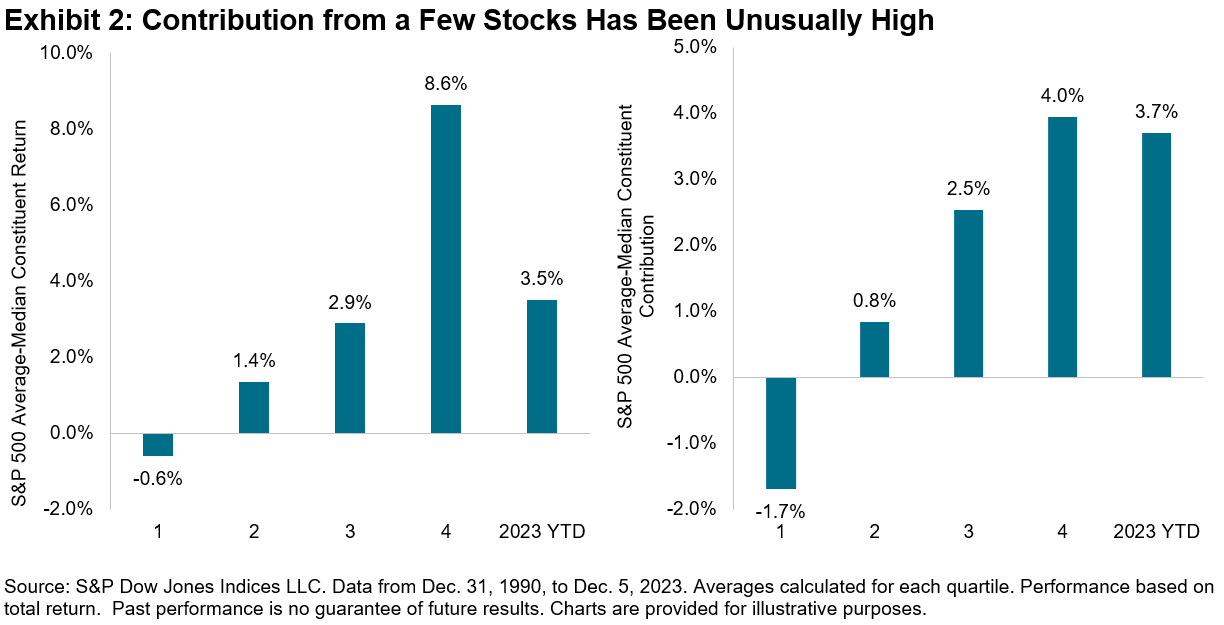
While small caps recovered in November, this year’s large-cap-led rally has been unusual in terms of its narrow breadth. We can visualize this in Exhibit 2, where we rank the historical annual S&P 500 returns in our database by skewness of constituent returns, as measured by the difference between the average versus median constituent return, and subsequently divide them into quartiles. Then we perform the same exercise, now ranking by skewness of constituents’ return contribution. So far this year, the average return has been greater than the median by 3.5%, in between the third and fourth quartile, while the average constituent contribution has been greater than the median by 3.7%, placed right below the fourth quartile level. These relatively extreme results are consistent with the concentration of outperformance within the Magnificent Seven stocks, which has been unusually high relative to history, and perhaps a headwind for more concentrated active managers that are underweight the largest stocks.
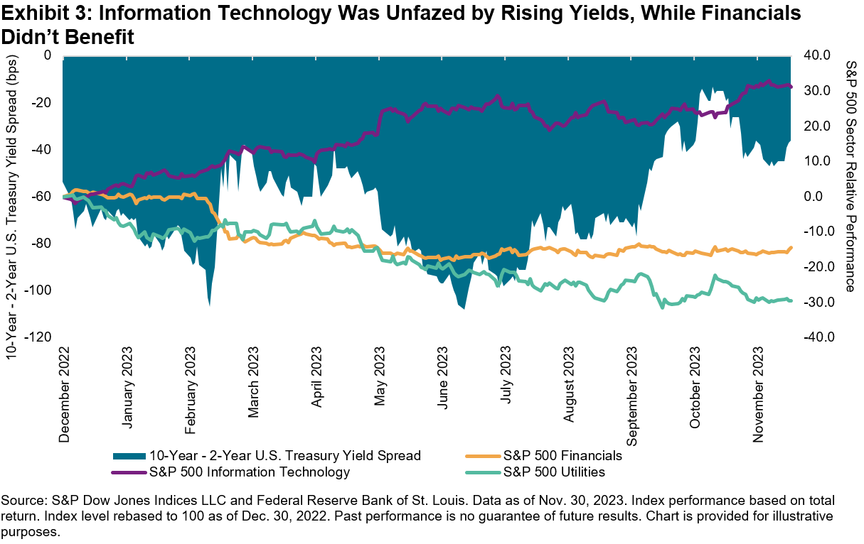
Returning to the ascent of 10-year Treasury yields, the rise was not limited to the long end of the curve, with a significant climb in short-term Treasury yields on the back of Fed rate hikes to combat inflation. But as 10-year yields picked up steam, the inverted yield curve began to disinvert. At a sector level, Exhibit 3 shows that the momentum in Information Technology has continued despite the sector’s traditional sensitivity to higher rates, while Utilities, traditionally more bond-like in nature, is unsurprisingly the worst sectoral performer YTD. What is surprising is that while Financials should benefit from the disinversion of the yield curve, which can improve banks’ net interest margins, the sector has not managed to fully recover post the Silicon Valley Bank tumult.
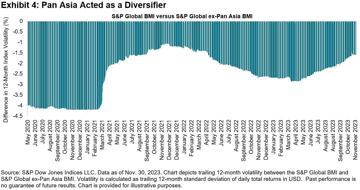
In addition to spectacular equity performance, we witnessed a strong recovery in fixed income compared to last year’s abysmal performance, with the iBoxx Liquid Investment Grade up 8% in November, its best monthly return since December 2008. But while absolute performance has been rosy, risk-adjusted performance can be more challenging given continued positive correlations between equities and bonds, a natural outcome of gains across both asset classes. Meanwhile, despite China’s economic and real estate woes, with the S&P China 500 down 14% in USD terms year-to-date, Asian markets offered some solace, as we see in Exhibit 4, where a consistent negative spread in trailing 12-month volatility between the S&P Global BMI and S&P Global ex-Pan Asia BMI indicates Pan Asia has acted as a diversifier.
Putting risk into context, despite geopolitical tensions coupled with lingering inflation and recession concerns, Exhibit 5 shows that the market has been at ease, with the VIX® trending downward in the past 12 months, ending November below the 13 handle. But what signal has low equity implied volatility given for future equity returns historically? We rank the same years in our database by VIX and divide them into three buckets based on a VIX level at year-end of less than 13, between 13 and 20, and above 20. Historically, we see a linear relationship between the year-end level of VIX and median subsequent year S&P 500 returns, indicating that, on average, years ending with higher implied volatility tended to be followed by higher returns.
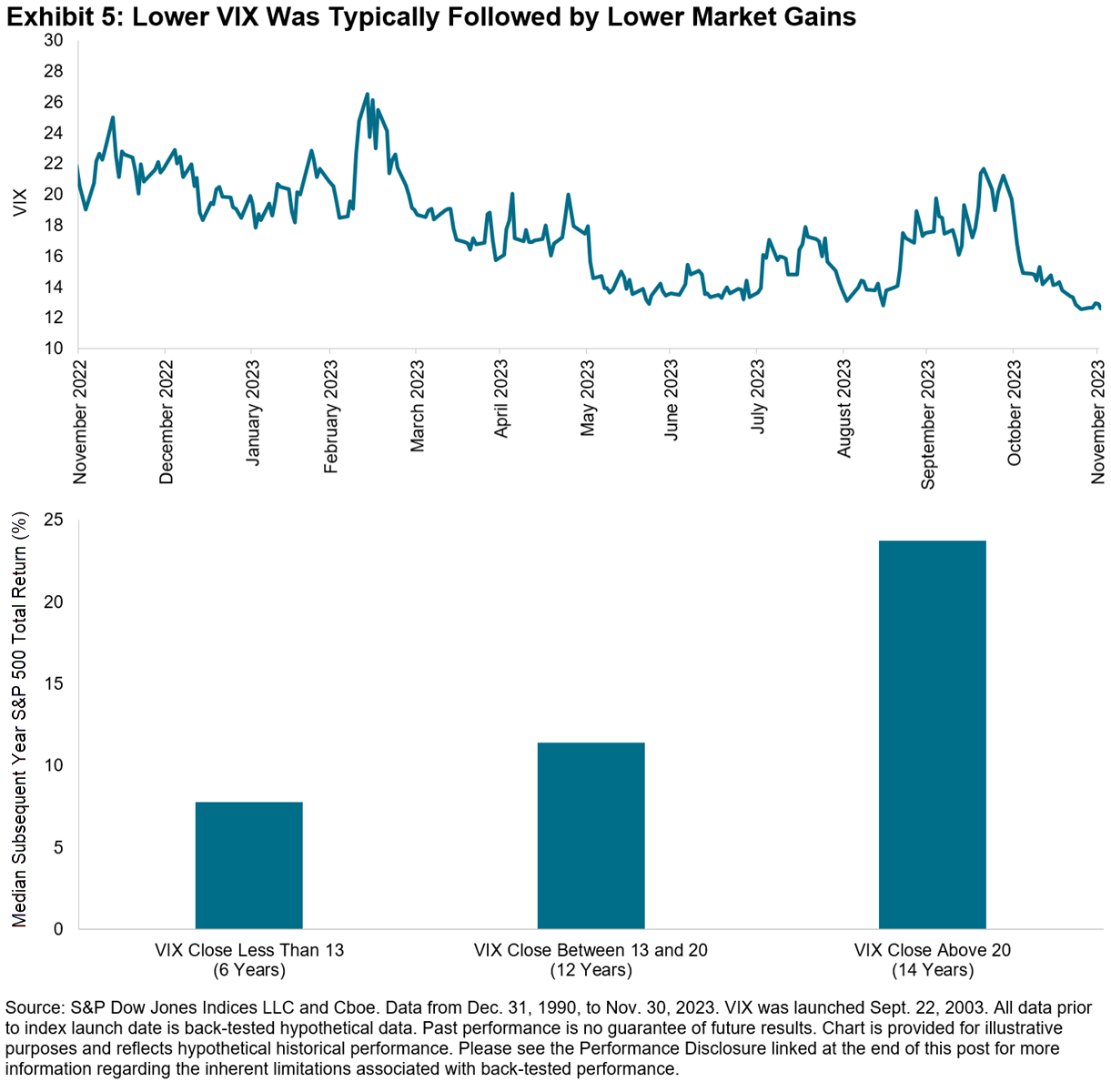
While predicting the future has proven to be a futile exercise, if VIX continues to maintain its standing in the lowest equity implied volatility bucket, a pullback from this year’s extraordinary market performance would not be shocking.
1 YTD as of Dec. 5, 2023.
The posts on this blog are opinions, not advice. Please read our Disclaimers.
Tracking Thematics: How Indexing Megatrends Works
- Categories Thematics
- Tags 4th industrial revolution, changing demographics, clean energy, Climate Transition, disruptive technology, Electric Vehicles, ESG, health care, Jason Ye, machine learning, megatrends, natural language processing, robotics, S&P Kensho New Economies, sustainability, thematics
What’s driving interest in thematics and how can indices help investors target world-shaping structural trends? Join S&P DJI’s Jason Ye for a closer look at how innovative benchmarks, including the S&P Kensho New Economy Indices, are tracking long-term, market-altering themes by design.
The posts on this blog are opinions, not advice. Please read our Disclaimers.Who’s Naughty and Nice

- Categories Equities
- Tags 2023, Benedek Voros, equity performance, global equities, IIS, institutional investor, S&P 400, S&P 500, S&P 600, S&P BSE SENSEX, S&P Europe 350, S&P France BMI, S&P Germany BMI, S&P Italy BMI, S&P TOPIX 150, S&P TSX 60, S&P United Kingdom, S&P/HKEex LargeCap, Santa Claus Rally
At this time of year, my 9 year old excitedly polishes his boots so that, according to Hungarian tradition, Santa can fill them with sweets and toys during the night between December 5 and 6 (yes, he does arrive a few weeks early in Central Europe). Just like in years past, I am sure he won’t be disappointed. But will Old Saint Nick have any goodies for equity investors too?
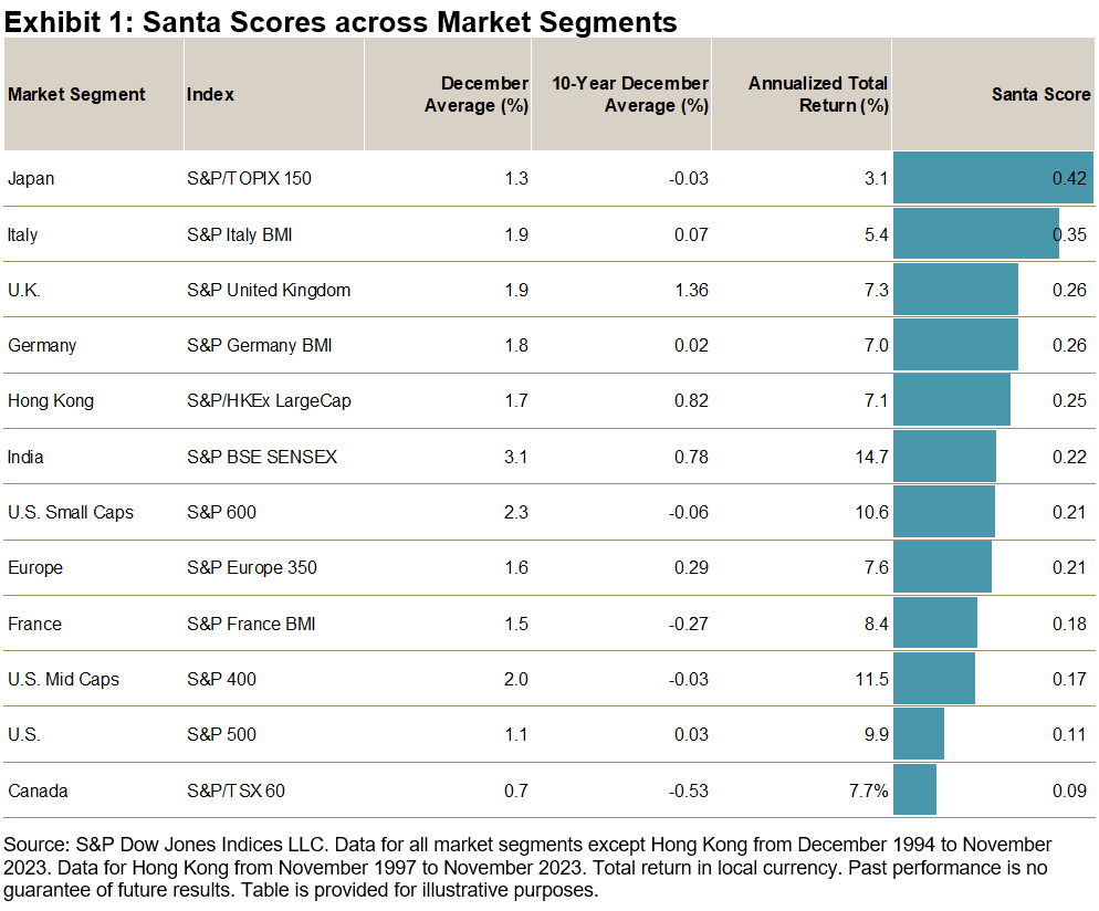
History suggests that there is at least some evidence supporting the idea of a “Santa Claus Rally.” We call our light-hearted measurement of choice the “Santa Score,” which we define as the ratio of a market’s average performance in the month of December to its total return in the corresponding year. Since there are 12 months in the year, a Santa Score of one-twelfth (around 0.08) would indicate that December had an average impact on the year’s total return. A Santa Score above 0.08 indicates that December was a better month for stocks, on average, than the other 11 months of the year.
As it turns out, all 12 market segments that we selected for our analysis fared well on the test. The Santa Score’s cross-market average of 0.23 indicates that since 1994, December, on average, has been about three times more profitable than other months. Having said that, there have been significant differences across various regions: Japanese investors usually had a happy and profitable December, with the last month of the year producing, on average, five times the return of the average month; meanwhile in Canada, December returns have tended to be only slightly above average. It is also notable that Santa was somewhat stingier in the past decade than in the previous two: the December average return in the last 10 years was significantly lower than in the prior 18 years, with 3 out of 12 market segments surveyed delivering an outright negative average return in the Decembers between 2013 and 2022.
Santa is known to reward nice children with candies but to leave coal for the naughty. Does he do something similar for equity markets? As Exhibit 2 shows, he does indeed. Historically, the average equity performance during December tends to be much better when the previous 11 months’ return was positive (“nice”) than when it was negative (“naughty”), with the spread widest in Canada, at 5.2%. The only exception is U.S. small caps, which tends to benefit from a January effect instead.
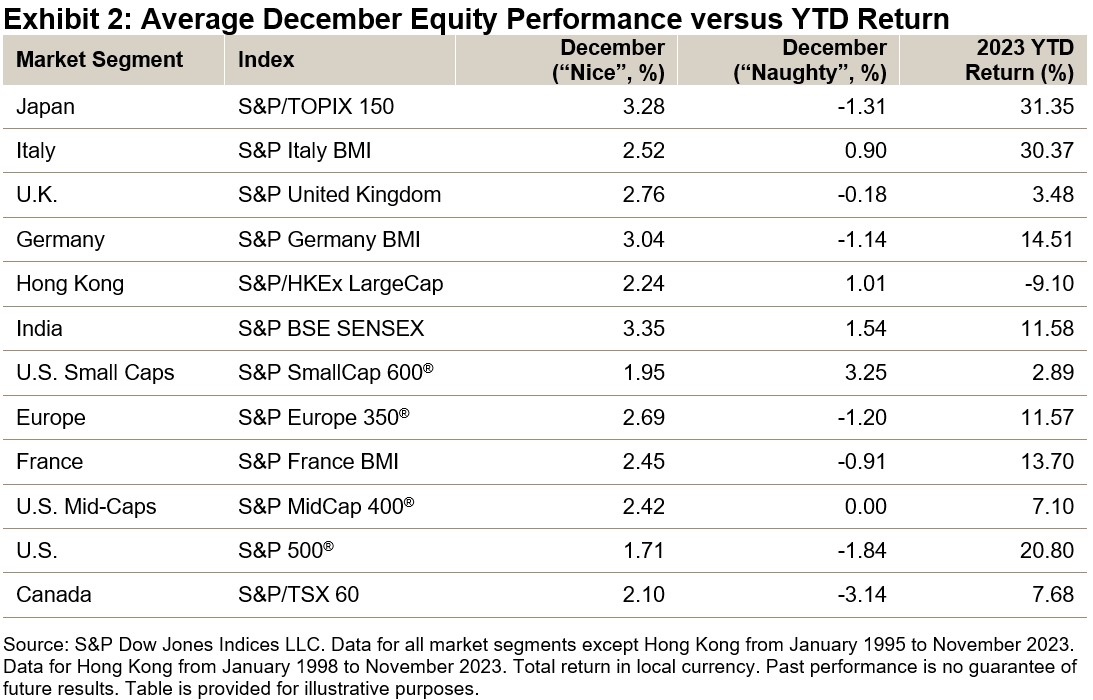
Looking at YTD returns, the good news is that all market segments besides Hong Kong have been nice so far in 2023—let’s hope Santa takes notice. But regardless of where markets head in the next few weeks: Happy holidays and a prosperous New Year to all!
The posts on this blog are opinions, not advice. Please read our Disclaimers.