Get Indexology® Blog updates via email.

In This List

The S&P GARP Index Series Expands to Include S&P MidCap 400 and S&P SmallCap 600 Versions

How Does the S&P 500 ESG Index Work?

Active or Agnostic?

Where’s Your Carbon Gone? How the S&P PACT Indices Decarbonize

Connecting the S&P/ASX 200 to U.S. Equity Icons

The S&P GARP Index Series Expands to Include S&P MidCap 400 and S&P SmallCap 600 Versions

Contributor Image
Wenli Bill Hao

Director, Factors and Dividends Indices, Product Management and Development

S&P Dow Jones Indices

The S&P 500® GARP (Growth at a Reasonable Price) Index was launched in February 2019 to strike a balance between pure growth and pure valuation. Due to its popularity among market participants, this index series has recently been expanded to include the S&P MidCap 400® GARP Index and the S&P SmallCap 600 GARP® Index.

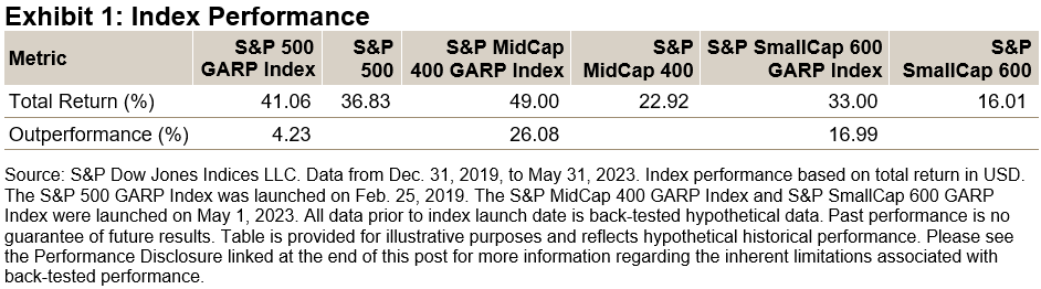
The S&P GARP Index Series strives to select companies with consistent earnings and sales growth, as well as strong earnings power, solid financial strength and reasonable valuation. Since the launch of the S&P 500 GARP Index, global economies have weathered the COVID-19 pandemic and the ongoing Ukraine-Russia conflict. As a result, high inflation and rising interest rates have been hallmarks of this time period. From the beginning of 2020 through to the end of May 2023, it is interesting to note that all three S&P GARP indices have outperformed their corresponding benchmarks (See Exhibit 1) by a wide margin. Therefore, selecting profitable growth stocks with more reasonable valuations has been a worthwhile strategy during this period.

In this blog, we will examine the S&P GARP Indices’ construction methodology, historical performance, sector compositions and factor exposures.

Methodology Overview 

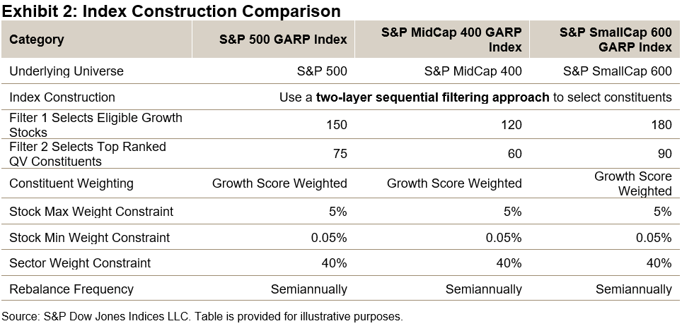
The S&P GARP Index methodology uses a two-layer sequential filtering approach to select its constituents.1 In the first step (filter 1), stocks are ranked by their growth z-scores (three-year EPS and SPS growth), with a targeted number of top-ranked stocks remaining eligible for constituent inclusion.2 In the second step (filter 2), the eligible stocks are ranked by their quality & value (QV) composite z-scores and a targeted number of top-ranked stocks are selected. The QV Score is based on the average of two quality factors (return on equity and financial leverage ratio) and one value factor (earnings-to-price ratio).

As illustrated in Exhibit 2, the resulting constituents represent growth stocks with relatively higher quality and value characteristics. The selected constituents are weighted proportional to their growth exposure, subject to the maximum individual weight of 5% and sector weight of 40%. This approach seeks to provide purer growth exposure and limit concentration risk.

Performance Comparison

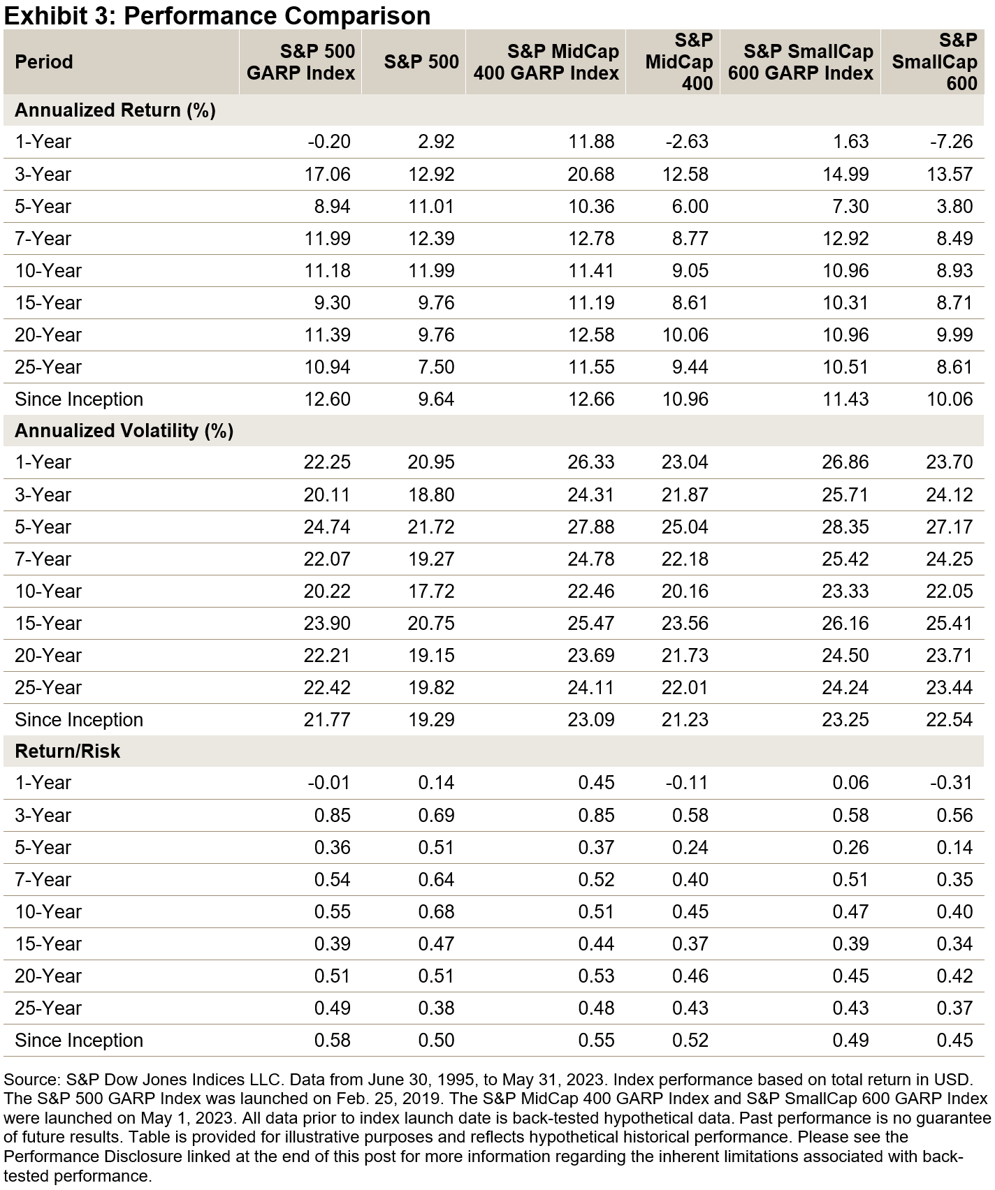
Historically, over the long term, the S&P GARP Indices outperformed their corresponding benchmarks in terms of both total and risk-adjusted return. The results show that the approach of selecting profitable growth stocks with reasonable valuations has yielded meaningful results over longer periods. In addition, both the S&P MidCap 400 GARP Index and the S&P SmallCap 600 GARP Index outperformed their corresponding benchmarks for all periods studied (see Exhibit 3).

Sector Composition

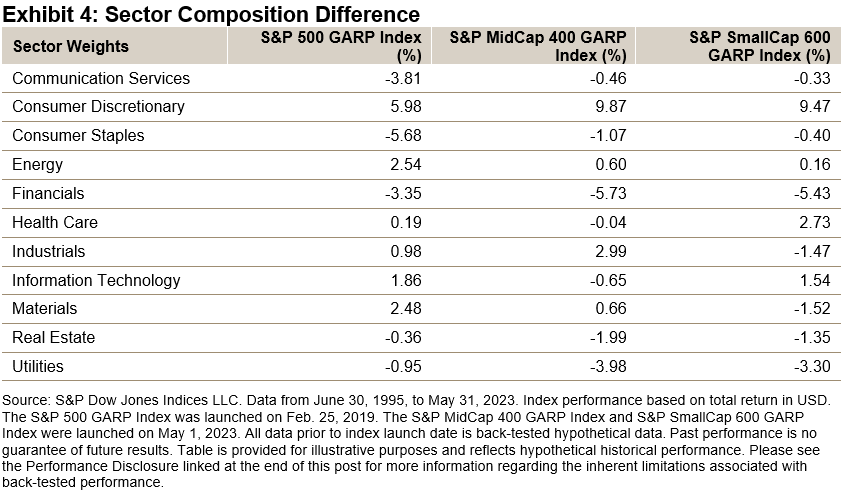
Exhibit 4 shows the historic sector exposure difference between the S&P GARP Indices versus their benchmarks. The S&P GARP Indices have had a noticeable overweight in Consumer Discretionary and an underweight in Financials, Consumer Staples, Utilities and Communication Services.

Factor Exposure

Exhibit 5 shows the factor characteristics as measured through the lens of Axioma Risk Model Factor Z-scores. The strategies had higher exposure to earnings and sales growth, profitability and earnings yield, while having lower leverage (lower exposure to leverage ratio).

Conclusion 

As the simulated performance shows, applying the S&P GARP Index methodology to the mid-cap and small-cap universes has resulted in outperformance over the long term. For market participants looking to gain exposure across the market cap range, the S&P MidCap 400 GARP Index and the S&P SmallCap 600 GARP Index are a welcome addition to the S&P GARP Index Series.


1 Hao, W. and Soe, A., Indexing GARP Strategies: A Practitioner’s Guide, S&P Dow Jones Indices, 2019.

2 The indices apply 20% selection buffer according to the following process: 1. Rank the top Growth z-score stocks by QV composite z-score. Select automatically the top 80% highest ranking stocks for index inclusion. 2. Select current constituents ranked within the top 120% by QV composite z-score for index inclusion in order of QV composite z-score until the target QV count is reached. 3. If, at this point, there are not enough constituents selected to meet the QV count, select non-constituents based on QV composite z-score ranking until the target count is reached.

The posts on this blog are opinions, not advice. Please read our Disclaimers.

How Does the S&P 500 ESG Index Work?

Look under the hood of the sustainability-focused version of the S&P 500 and discover how index design influences diversification and performance.

The posts on this blog are opinions, not advice. Please read our Disclaimers.

Active or Agnostic?

Contributor Image
Craig Lazzara

Former Managing Director, Index Investment Strategy

S&P Dow Jones Indices

In order to generate value for his clients, an active investment manager must deviate from a passive benchmark—by choosing sectors, or styles, or individual stocks that the manager predicts will outperform. The manager’s value is dependent on the accuracy of his predictions; the better he is at identifying the best sectors, or styles, or stocks, the better his results will be. A passive manager, on the other hand, acknowledges his (literal) ignorance about future returns.

How accurate do active predictions need to be? How accurate are they in practice? A simple thought experiment can help explore these questions: we’ll think simply about rotating between growth and value as a means of outperforming the S&P 500®. For the 10 years ending in December 2022, the S&P 500’s total return was 12.6%, while the S&P 500 Growth and S&P 500 Value indices returned 13.6% and 10.9%, respectively. Since Growth and Value combined compose the S&P 500, Exhibit 1 is unsurprising.

Suppose, arguendo, that an investor shifts annually to the style he predicts will outperform. The limits on such an investor’s performance are shown in Exhibit 2.

An investor who was correct every year would hypothetically earn a compound return of 18.2% for the period; if he was wrong every year the CAGR would fall to 6.6%.

Of course, it’s unlikely that anyone trying this strategy in real life would be correct—or incorrect—every year. Exhibit 3 shows how the return to a tactical rotational strategy would vary depending on the probability of making the correct call. With a probability of 0.1, e.g., at the beginning of every year, the investor would have a 10% likelihood of choosing the better performer and a 90% likelihood of choosing the worse performer.

If every decision were right (probability = 1.0), the investor’s CAGR would be 18.2%; if every decision were wrong (probability = 0.0), it would be 6.6%. What’s interesting is to observe what happens between those limits, as summarized in Exhibit 4.

From these observations we can make some inferences about the prospects for successful style rotation:

  • The performance of the median large-cap U.S. equity manager in our SPIVA® database is consistent with a 36.35% probability of making the right style call—-i.e., worse than a coin flip.
  • Flipping a coin would have produced approximately the return of the S&P 500, which would have meant a top-quartile ranking for a large-cap U.S. equity manager. But if flipping a coin is the best you can do, it’s better not to bother and just track the S&P 500.
  • Predictive accuracy levels above 63% would have produced returns that no manager actually produced, which implies that no active manager had that level of predictive accuracy.

Passive investors can be comfortable in their agnosticism.

The posts on this blog are opinions, not advice. Please read our Disclaimers.

Where’s Your Carbon Gone? How the S&P PACT Indices Decarbonize

Contributor Image
Kieran Trevor

Analyst, ESG Research & Design, ESG Indices

S&P Dow Jones Indices

As the world aims to decarbonize toward a net zero future, the importance of tracking the carbon footprint of portfolios is becoming a primary focus for many investors; specifically, to measure and understand whether portfolios emulate the emission reduction targets needed globally to help mitigate the impacts of climate change.

For investors, tracking an EU Paris-Aligned Benchmark, such as S&P 500 Net Zero 2050 Paris-Aligned ESG Index, may provide a way to avoid the hassle, as the index embeds an initial 50% greenhouse gas (GHG) reduction and a minimum 7% year-over-year decarbonization rate in its construction, while historically maintaining similar performance characteristics to the benchmark index.1

Between February 2021 and February 2023, the S&P 500 Net Zero 2050 Paris-Aligned ESG Index reduced its carbon intensity by 24.1%, beating its minimum required decarbonization of 13.5% in that same period. The Industrials, Financials, Health Care and Consumer Discretionary sectors all decarbonized by over 30%, with carbon intensity increases observed in Consumer Staples, Real Estate and Communication Services. All Energy stocks were excluded from the index throughout due to the index construction.

But how has this decarbonization been achieved? We break this down to uncover the real drivers of the changes in carbon footprint within the index.

Carbon Attribution

First, we split the index into three separate groups:

  • Incoming Positions: Representing constituents that only joined the index after February 2021;
  • Outgoing Positions: Representing constituents that were removed from the index between the February 2021 and February 2023; and
  • Maintained Positions: Representing constituents that were present in the index since February 2021.

Splitting the index into distinct periods allows us to more accurately attribute how carbon came into the index and how it has been removed. In this case, a large proportion of carbon has been removed through divestment of companies from the index, which accounted for a decarbonization of 32% (see Exhibit 2) relative to the base-level carbon intensity. Meanwhile, new companies entering the index increased carbon intensity by 4.9%, and companies that maintained their position in the index in both periods were responsible for a rise of 3%.

Next, we run a carbon attribution analysis on the maintained positions to see what’s driving their net growth in carbon intensity. We observe that this was driven entirely by weighting within the index, which given the reduced count of overall companies in the index during this time from 358 to 313, makes intuitive sense. The interaction effect between a company’s weight and its carbon intensity also helped reduce the index-level carbon footprint. Company behavior, represented by the actual carbon intensity change of companies in the index, had a reductive impact on overall intensity by over 15%.

Finally, breaking this promising trend down further by attributing the intensity change, we observe that this effect was driven in part by market conditions (EVIC), but mostly by emission reductions of these companies, while the interaction effect between these two was minimal.

Carbon attribution analysis can be a powerful tool for market participants looking to reduce the carbon footprint of their investments, and it can be used to help maintain their decarbonization. Luckily, the S&P PACT™ (S&P Paris-Aligned & Climate Transition Indices may provide a way to make this easier, embedding a 7% year-over-year decarbonization rate by design and aligning with a net zero future.

1 See S&P Paris-Aligned & Climate Transition (PACT) Indices Methodology for more information.

The posts on this blog are opinions, not advice. Please read our Disclaimers.

Connecting the S&P/ASX 200 to U.S. Equity Icons

Contributor Image
Sherifa Issifu

Senior Analyst, U.S. Equity Indices

S&P Dow Jones Indices

Many market participants have a “home bias,” typically having larger exposures to domestic securities than would be determined by their representation in the global opportunity set. Australia is no exception: compared to Australia’s 2% weight in the S&P Global BMI, Australian investors allocated an estimated 49% of their total equity allocation to domestic stocks at the end of 2022.1

Exhibit 1 shows that Australia’s home bias—as measured by the difference between investors’ total domestic equity exposure and the country’s weight in the S&P Global BMI—is larger than several of its developed market peers, such as Canada, Japan and the U.K.

Such home bias means that investors have less exposure to the U.S. equity market, which makes up nearly 60% of the S&P Global BMI. The S&P Composite 1500® represents the investable portion of the U.S. equity market (~90%) by combining the large-cap S&P 500®, S&P MidCap 400® and the S&P SmallCap 600® and leaving out less liquid and lower quality stocks.

The U.S. is home to well-known global mega-cap names such as Apple and Microsoft, which may help to balance Australia’s overweight to Financials and Materials. Exhibit 2 shows that combining the U.S. and Australia’s equity benchmarks may help alleviate the domestic sector biases. Compared to the S&P Global BMI, the Australian bellwether underweights Information Technology by 18%, with I.T. being the S&P/ASX 200’s second-smallest sector, at 2%.

Potential diversification benefits could also have come in the form of improved risk/return profile. Exhibit 3 highlights that the S&P 500 outperformed the S&P/ASX 200 by 2% annualized since Dec. 30, 1994, in local currency and U.S. dollar terms. This makes the long-run outperformance of the S&P 400® and S&P 600® even more impressive; the non-perfect correlations of these indices versus the S&P 500 (shown in Exhibit 4) also means there is an opportunity for investors to diversify within their U.S. equity exposure as well to gain access to the unique characteristics of U.S. mid- and small-cap indices.

Exhibit 2 which shows that differences in sector composition may help explain the non-perfect correlation between the S&P/ASX 200 to our U.S. core equity indices, which ranges from 0.44-0.52 when looking at monthly returns in AUD terms, as illustrated in Exhibit 4. This moderate correlation suggests that combining the two sets of indices may lead to better risk-adjusted return than either one in isolation.

In Exhibit 5, we take the blue-chip benchmarks of both the U.S. and Australia and create hypothetical combinations of the S&P 500 and the S&P/ASX 200. We can see that adding the S&P 500 to the S&P/ASX 200 has historically improved return per unit of risk (risk-adjusted return) across all points on the efficient frontier over exposure to the S&P/ASX 200 alone.

While there are several reasons why Australian market participants may choose to have a home bias, in the past, U.S. equities helped investors diversify from sectoral home biases and historically improved domestic returns.


1 Thinking Ahead Institute, “GPAS 2023 Pensions Survey,” 2023.

The posts on this blog are opinions, not advice. Please read our Disclaimers.