Get Indexology® Blog updates via email.

In This List

Simplicity Yields Outperformance: The S&P 500 Low Volatility High Dividend Index

Data Driving the Weights within the S&P 500 Net Zero 2050 Paris-Aligned ESG Index

Combining Dividend Strategies

A Closer Look at Indexing Equal Weight

Bearing Through

Simplicity Yields Outperformance: The S&P 500 Low Volatility High Dividend Index

Contributor Image
Rupert Watts

Head of Factors and Dividends

S&P Dow Jones Indices

Last week, the S&P 500® officially entered a bear market, dropping more than 20% from its record close in January. However, not all equity indices suffered comparable losses, and one such example is the S&P 500 Low Volatility High Dividend Index. In fact, this index has outperformed by a wide margin so far in 2022.

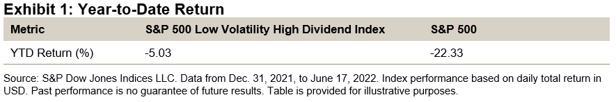
This may come as no surprise since this index combines two strategies that have individually beaten the S&P 500 YTD. High dividend strategies have been popular in the recent market environment of high inflation and rising interest rates, where current income and shorter duration stocks are considered more favorable by some investors. Similarly, low volatility stocks have outperformed due to their defensive qualities during increased market uncertainty.

Methodology

This index applies a simple, two-step constituent screening methodology to capture the benefit of high dividend and low volatility strategies. First, the index selects the top 75 highest-yielding stocks in the S&P 500 based on their 12-month trailing dividend yield. Then, it narrows those down to the 50 stocks with the lowest realized volatility over the past 252 trading days. The remaining stocks are then weighted by the trailing 12-month dividend yield.

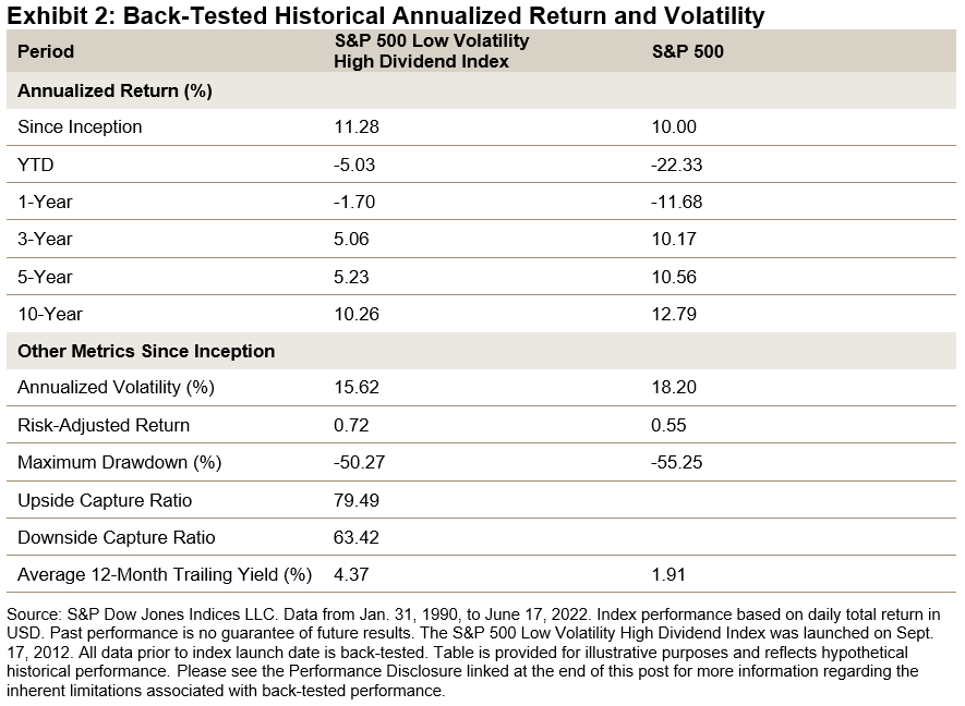
The index has delivered higher absolute and risk-adjusted returns than the S&P 500 since January 1990. Furthermore, it has had a lower downside capture ratio than similar high-yielding strategies since the low volatility screen acts as a quality measure to avoid high-yield stocks with sharp price drops.

Construction Philosophy

This index was built on the premise that high-yielding stocks tend to outperform the broad market in the long run. Our research team published a paper in 2019 showing just that. However, it also showed that this outperformance came at the cost of higher volatility and lower risk-adjusted returns.

The paper went on to argue that this high volatility could be attributed to the inclusion of high-yield stocks with a depressed price. Furthermore, it offered a potential remedy: a low volatility screen to help avoid high-risk companies.

This is amply demonstrated in Exhibit 3, which shows the performance of the following three hypothetical portfolios that are equally weighted.

  1. High-yield portfolio: 75 stocks from the S&P 500 with the highest dividend yield
  2. Low volatility/high-yield portfolio: 50 lowest volatility stocks selected from the high-yield portfolio
  3. High volatility/high-yield portfolio: 25 highest volatility stocks selected from the high-yield portfolio

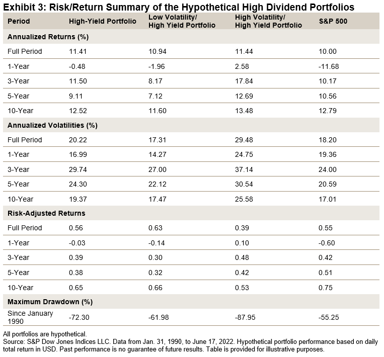
Since January 1990, the high-yield portfolio outperformed the S&P 500 by 1.4% annualized, but with higher volatility and a larger maximum drawdown. The low volatility/high-yield portfolio achieved a similar annualized return, but with 14.4% less volatility and a smaller maximum drawdown.

Finally, the high volatility/high-yield portfolio was much more volatile, with the lowest risk-adjusted return and largest maximum drawdown. Thus, out of these three hypothetical portfolios, the low volatility/high-yield portfolio delivered the highest risk-adjusted return and had the most pronounced maximum drawdown reduction.

Conclusion

For market participants looking for outperformance and a competitive yield with lower risk than other comparable high-yielding strategies, the S&P 500 Low Volatility High Dividend Index might be a worthy consideration.

The posts on this blog are opinions, not advice. Please read our Disclaimers.

Data Driving the Weights within the S&P 500 Net Zero 2050 Paris-Aligned ESG Index

Contributor Image
Barbara Velado

Senior Analyst, Research & Design, Sustainability Indices

S&P Dow Jones Indices

The World Meteorological Organization estimates that there is a 50% chance that global warming will exceed 1.5°C before 2026.1 The International Panel on Climate Change has warned that time is running out—climate change is no longer a problem for the future, and its associated physical risks are materializing more evidently.2 The world may need to rapidly decarbonize to prevent irreversible impacts. The S&P PACT™ Indices (S&P Paris-Aligned and Climate Transition Indices) are designed to select equity securities that collectively aim to meet the goals of the Paris Agreement. Here we dive into the power of data in driving the weights within the S&P 500® Net Zero 2050 Paris-Aligned ESG Index and let the underlying data speak for itself.

S&P Paris-Aligned Index Weights Explained

The S&P Paris-Aligned Indices start by excluding companies involved in undesirable business activities, and then the remaining constituents are reweighted based on their ESG and climate performance.3 This blog will focus on specific companies’ case studies to better illustrate this reweighting effect.

Climate and ESG Data Driving the Weights

Exhibit 2 highlights how the underlying climate and ESG metrics drive the weights allocated to some of the stocks within the S&P 500 Net Zero 2050 Paris-Aligned ESG Index. To provide transparency on a relative basis, we look at four pairs of companies within the same sub-industry and their percentage weight change relative to its underlying index, the S&P 500. Green colors depict relatively positive performance on a climate or ESG factor, while pink shades reflect weaker values.

McDonald’s and Domino’s, two of the largest names within the American restaurant industry, received different weights. Despite both having high exposure to physical risks, McDonald’s alignment with a 1.5°C carbon budget and stronger S&P DJI ESG Score helped the company to be overweighted by 46% compared with its underlying index. Conversely, Domino’s was allocated 0% weight due to being above its transition pathway budget, which is the climate factor responsible for the largest reweighting effect.4 Since only 32%5 of stocks within the underlying index are below their respective 1.5°C carbon budgets, significant reweightings are applied at the stock level for the overall index to be 1.5°C compatible.

Apple and HP show similar alignment to a 1.5°C trajectory on a forward-looking basis and comparable physical risk scores. HP’s stronger sustainability performance, as measured by its S&P DJI ESG Score, led to its overweight (99%), while Apple lost some of its ground (-29%). As the S&P 500 Net Zero 2050 Paris-Aligned ESG Index targets a 20% increase of index-level ESG score relative to the underlying index, the ESG score plays a large role within the reweighting effect. Incorporating the ESG score into this climate strategy allows for a more holistic ESG performance assessment than looking at climate factors in isolation.

Within Electric Utilities, Exelon was underweighted (-14%) due to its high physical risk score, indicating high sensitivity and exposure to physical risks. Along with consideration for transition risks, the S&P 500 Net Zero 2050 Paris-Aligned ESG Index also aims to mitigate physical risks to fully address climate risks at the index level, aligning with the TCFD recommendations.6 FirstEnergy, despite having lower green-to-brown revenue share, received a large overweight (263%) thanks to being below its 1.5°C carbon budget and lower physical risk score.

Lastly, within Specialty Chemicals, both Albemarle and PPG Industries were overweighted, albeit to different degrees. Despite being below its 1.5°C carbon budget and displaying a similar S&P DJI ESG Score to Albemarle, PPG Industries’ high physical risk score curbed its overweight to 21%, while its peer’s weight was boosted by 277%.

We aim to provide transparency on how the S&P PACT Indices constituents’ weights are determined by their climate and ESG performance. Coupled with the 7% year-on-year self-decarbonization pathway, the S&P PACT Indices seek to offer an efficient and multifaceted solution for investment product providers to align investments with a net-zero journey.


1 According to the World Meteorological Organization (WMO) Climate Update.

2 According to the contribution of IPCC’s Working Group II to the Sixth Assessment Report on Climate Change 2022: Impacts, Adaptation and Vulnerability.

3 Please see the S&P Paris-Aligned and Climate Transition Indices Methodology for more information.

4 Leale-Green, B., Velado, B. (2020). Exploring S&P PACT Indices Weight Attribution.

5 As of March 31, 2022, 32% of constituents by index weight within the S&P 500 were under their carbon budget for 1.5°C climate scenario alignment.

6 Final Report: Recommendations of the Task Force on Climate-Related Financial Disclosures (2017), available here.

The posts on this blog are opinions, not advice. Please read our Disclaimers.

Combining Dividend Strategies

Contributor Image
Craig Lazzara

Former Managing Director, Index Investment Strategy

S&P Dow Jones Indices

Throughout this year’s market turmoil, dividend strategies have been among the most reliable sources of relative, if not absolute, performance. Through June 21, 2022, e.g., when the S&P 500® had declined -20.4% YTD, the S&P 500 High Dividend Index (roughly speaking, the 80 highest-yielding stocks in the 500) sustained a loss of only -3.7%. The S&P 500 Dividend Aristocrats®, which focuses on dividend growth rather than absolute dividend levels, declined -14.0%—well behind its higher-yielding compatriot but still significantly ahead of the market as a whole.

We’ve commented before on the relative merits of dividend yield and dividend growth strategies, suggesting that their comparative performance is analogous to the shifting performance of value and growth. For nearly 15 years, as S&P 500 Growth dominated S&P 500 Value, the Dividend Aristocrats handily outperformed High Dividend. At the beginning of 2022, however, the tables turned: Value is trouncing Growth, and dividend yield is well ahead of dividend growth.

Lacking the ability to forecast the future relative performance of High Dividend and Dividend Aristocrats (or at least the ability to forecast it accurately), it’s natural to wonder about the results of combining the two strategies. Although the short-term advantage can shift between the two indices, in the long run the performance of High Dividend and Dividend Aristocrats has been comparable, and the correlation between their relative returns has typically been in the 0.6 to 0.7 range. This suggests that the indices’ co-movement, although reasonably strong, is not perfect, so that combining them might produce at least some diversification benefit. Exhibit 1 illustrates this with three sets of index combinations.

The gold curve illustrates combinations of the S&P 500 and the S&P 500 High Dividend Index. High Dividend has had both higher historical returns and higher risk than the 500, so the efficient frontier between them, after some initial curvature, moves upward and to the right, as all good efficient frontiers are wont to do.

The blue curve is more interesting; it shows combinations of the S&P 500 and the S&P 500 Dividend Aristocrats. Notice that this efficient frontier moves upward and to the left; Dividend Aristocrats historically has had higher returns and been less volatile than the S&P 500. It is, in other words, a member in good standing of the class of indices that benefit from the low volatility anomaly—the tendency of stocks with below-average volatility to outperform the market as a whole.

Most interesting of all is the green curve, which illustrates combinations of the Dividend Aristocrats and High Dividend indices. It’s interesting because it dominates both the efficient frontiers beneath it. Combinations of Dividend Aristocrats and High Dividend have provided more return for the same level of risk as combinations of either index singly with the S&P 500.

This finding implies that dividend-seeking investors need not feel pressured to choose between dividend levels and dividend growth. Combining the two strategies can potentially produce a more attractive risk/return profile than holding either in isolation.

The posts on this blog are opinions, not advice. Please read our Disclaimers.

A Closer Look at Indexing Equal Weight

How does indexing equal weight work in times of volatility and inflation? S&P DJI’s Craig Lazzara and Invesco’s Nick Kalivas discuss the key drivers behind equal-weight’s historical outperformance vs. the benchmark and what happens when equal weight is combined with factors and/or ESG.

The posts on this blog are opinions, not advice. Please read our Disclaimers.

Bearing Through

Contributor Image
Fei Mei Chan

Former Director, Core Product Management

S&P Dow Jones Indices

On Monday, June 13, 2022, the S&P 500® officially entered bear market territory, having lost more than 20% of the value from its peak on Jan. 3, 2022. Just as we didn’t know on Jan. 3 that the market was going to decline, today we don’t know the full extent and duration of the new bear market.

An obvious way to consider this question is to compare the current decline with its historical predecessors. Exhibit 1 shows that we are now experiencing the fourth bear market in the last 30 years. Its 23% decline so far is smaller than the other three, and substantially smaller than the declines in the aftermath of the Technology Bubble (2000-2002) and the Global Financial Crisis (2008). Of course, it’s fair to observe that the current decline is not over.

We’ve found that dispersion and correlation can provide useful context around market dynamics. Exhibit 2’s dispersion-correlation map shows that historically, poor markets have only occurred in the presence of high dispersion. (Importantly, the converse is not true: high dispersion is not a reliable indicator of poor markets.) This was particularly evident in both the Technology Bust (2000-2002) and the 2008 Global Financial Crisis. Average monthly dispersion levels in those years all exceeded 30%. In contrast, dispersion so far in 2022, while higher than its long-term median, has remained lower than in the previous two bear markets. Whether this remains the case when the current bear market finally ends is another subject of uncertainty.

As of June 17, 2022, we are 165 days into the current bear cycle. As Exhibit 3 shows, both the Tech Bust and the Global Financial Crisis lasted much longer (929 days and 517 days, respectively). As when we entered the bear market in January, we won’t know that it’s over until after the fact.

The posts on this blog are opinions, not advice. Please read our Disclaimers.