Get Indexology® Blog updates via email.

In This List

Introducing the S&P 500 ESG Dividend Aristocrats Index

Looking for Income – The Case for Dividends

Seven Days in May

Defending with S&P Dividend Aristocrats

These Go to 11: Diversification with S&P 500 Sectors

Introducing the S&P 500 ESG Dividend Aristocrats Index

Contributor Image
George Valantasis

Associate Director, Factors and Dividends

S&P Dow Jones Indices

Investors are increasingly aspiring to align their investment objectives with their personal and societal values. At the same time, dividends are at the top of investors’ minds, as monetary policies tighten globally and volatility in the financial markets increases. In light of these trends, S&P Dow Jones Indices (S&P DJI) recently launched the S&P 500® ESG Dividend Aristocrats® Index, the latest addition to the S&P ESG Dividend Aristocrats Indices family.

A Focus on Dividends and ESG

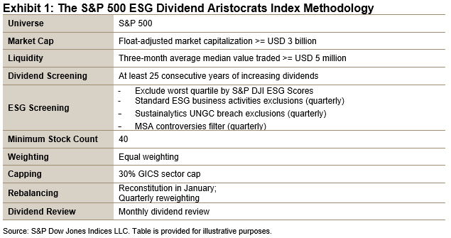
Exhibit 1 details the methodology of the S&P 500 ESG Dividend Aristocrats Index. The rules are consistent with the S&P 500 Dividend Aristocrats Index plus an ESG overlay. First, the index selects companies in the S&P 500 that have consistently increased dividends every year for at least 25 consecutive years. Next, multiple ESG screens are applied. The index excludes companies in the lowest quartile of S&P DJI ESG Scores.1 Additional ESG exclusion reviews are conducted quarterly based on business activities,2 United Nations Global Compact (UNGC) breaches3 and a Media and Stakeholder Analysis (MSA)4 controversy filter. Lastly, the remaining constituents are equally weighted and rebalanced quarterly.

Comparison of S&P DJI ESG Scores and Dividend Yields

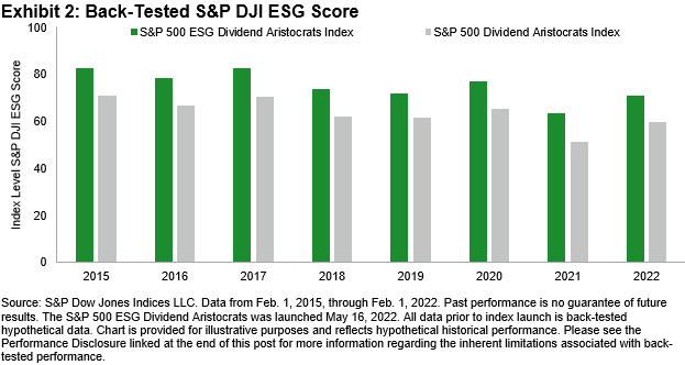
Turning to the index characteristics, Exhibit 2 shows that the S&P 500 ESG Dividend Aristocrats Index offered notable S&P DJI improvement over the S&P 500 Dividend Aristocrats Index. The S&P DJI ESG Score was improved, on average, by approximately 11.5 points per year, more than an 18% annual improvement.

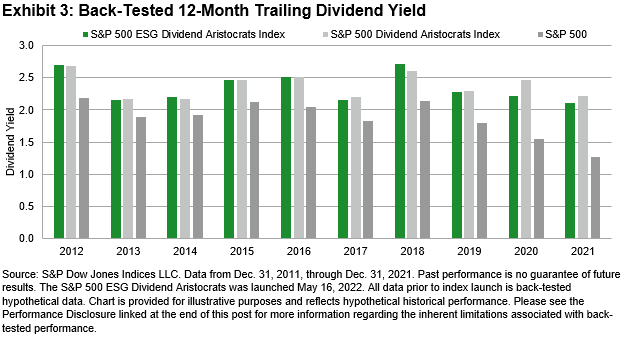
Looking at Exhibit 3, the S&P 500 ESG Dividend Aristocrats Index and the S&P 500 Dividend Aristocrats Index have had comparable yields, and both have held a significant yield advantage over the S&P 500. Over the full period examined, the average annual dividend yields for the S&P 500 ESG Dividend Aristocrats Index, S&P 500 Dividend Aristocrats Index and S&P 500 were 2.35%, 2.38% and 1.88%, respectively.

Performance

Exhibit 4 shows that the S&P 500 ESG Dividend Aristocrats Index has generated higher risk-adjusted returns over the 3, 5, 7, 10 and full year periods versus the S&P 500 Dividend Aristocrats Index and S&P 500.

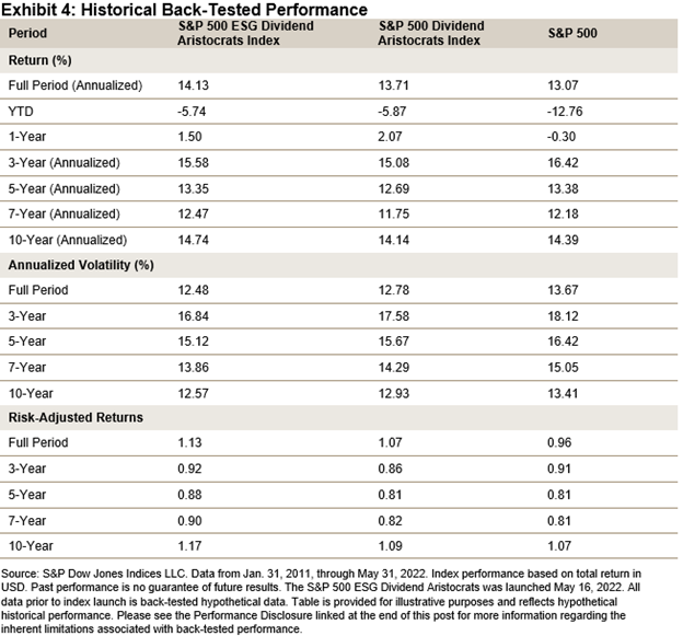
Interestingly, as financial conditions have tightened materially since the start of 2022, companies with consistent dividend payments have outperformed the broad market. Year-to-date, the S&P 500 ESG Dividend Aristocrats Index and the S&P 500 Dividend Aristocrats Index have outperformed the S&P 500 by 7.02% and 6.89%, respectively.

This may be due to two reasons; first, because cash returned to investors is more valuable now that real interest rates are rising,5 and second, because a company’s ability to consistently increase dividends could signal a durable business model that is well positioned to outperform throughout the business cycle.

When it comes to the goal of pairing consistent dividend paying companies with investment objectives that align personal and societal values, the S&P 500 ESG Dividend Aristocrats Index could be an option to consider.


  1. The S&P DJI ESG Scores are the result of further scoring methodology refinements to the S&P Global ESG Scores that result from S&P Global’s annual Corporate Sustainability Assessment, a bottom-up research process that aggregates underlying company ESG data to score levels.
  2. Companies with the following specific business activities are excluded: controversial weapons, thermal coal, tobacco products, oil sands, small arms and military contracting.
  3. As of each rebalancing reference date, companies classified as non-compliant with the United Nations Global Compact principles according to Sustainalytics are ineligible for index inclusion.
  4. The MSA monitors a company’s sustainability performance on an ongoing basis by assessing current controversies that could potentially threaten a company’s reputation or financial health.
  5. https://fred.stlouisfed.org/series/DFII10.


The posts on this blog are opinions, not advice. Please read our Disclaimers.

Looking for Income – The Case for Dividends

Contributor Image
Benedek Vörös

Director, Index Investment Strategy

S&P Dow Jones Indices

For decades, traditional wisdom held that U.S. investors seeking stable income should turn to bonds. However, after more than a third of a century of declining yields, the current market environment may require a less traditional approach.

Until recently, U.S. Treasuries have been a vehicle of choice for income-seeking investors: they provide a fixed stream of payments during their full tenor, and they offer the near-perfect certainty of both coupon and principal payments (a U.S. Government default is possible, but is perceived to be so unlikely that their payments are traditionally considered “risk free” in investment literature). In the three and a half decades before 2010, these characteristics were coupled with inflation-beating real returns, too. As Exhibit 1 shows, an investor who had bought 10-year U.S. Treasury bonds in September 1981 and held them to maturity would have realized a whopping 11.5% real return per year over the bond’s lifetime.

However, the post-Volcker bond bull market, often dubbed the “Great Moderation,” compressed both real and nominal returns available on U.S. Treasuries. Starting around 2010, the real returns on 10-year Treasuries that were bought at inception and held to maturity actually turned negative. The prospects haven’t improved much by now either: based on the relative prices of inflation-protected and standard Treasury bonds, real returns for 10-year Treasury bonds bought today are expected to be around 0.[1]

One alternative that has emerged as a potential source of regular and progressively increasing income is dividend-paying equities. Equity dividends have provided inflation protection over the medium to long term, with dividend growth surpassing the inflation rate historically. Taking a closer look at the S&P 500®, dividends paid out by index constituents rose from USD 140.1 billion in 2000 to USD 511.5 billion in 2021, corresponding to an increase by a factor of 3.7x and a compound annual growth rate of 6.4%. The rise in consumer prices, on the other hand, averaged just 2.3% over the same period. Exhibit 2 illustrates the significant spread between the dividend growth rate and the inflation rate over the past two decades, which translated to an increase of over 130% in the purchasing power of dividends paid out by S&P 500 constituents.

At least in aggregate, dividends have become a much more important potential source of income. But are investors taking advantage? According to data from the Bureau of Economic Analysis, dividends as a share of Personal Income have climbed from 3.2% in Q1 1980 to 7.3% in Q1 2022, whereas interest income has declined in share from 16.2% to 9.2% over the same period. In other words, dividends are indeed becoming more important, in both absolute and relative terms, to the average U.S. household’s “income statement.”

Given the significant shift in the relative importance of interest and dividend income, dividend-focused equity strategies may have an important role to play in income-focused investors’ portfolios. Dividend strategies, of course, come in many shapes and forms: S&P DJI’s range of dividend index offerings are designed to help investors achieve a variety of income goals by measuring the performance of strategies that seek to deliver high yield or stable payouts. Subsequent blogs in this series will take a closer look at some of S&P DJI’s dividend strategies available to the U.S. and international equity investors.

[1] Using U.S. inflation breakevens—calculated by subtracting the real yield of the inflation-linked maturity curve from the yield of the closest nominal Treasury maturity—as a proxy for inflation in the next 10 years. Source: S&P Dow Jones Indices LLC, Bloomberg as of May 31, 2022.

The posts on this blog are opinions, not advice. Please read our Disclaimers.

Seven Days in May

Contributor Image
Craig Lazzara

Former Managing Director, Index Investment Strategy

S&P Dow Jones Indices

The performance of S&P 500®-based factor indices in May 2022 was generally favorable. Most factors outperformed the S&P 500, with the league table dominated by value and dividend tilts. The overall results for the month, however, obscure the intra-month dynamics: between the end of April and May 19, the S&P 500 fell by 5.5%, compounding the loss of 12.9% it had incurred in the first four months of the year. Despite briefly trading in bear market territory, in the last seven trading days of May, the index rallied 6.0% to finish the month with a small gain.

It should surprise no one that the relative performance of factor indices varied widely between these two distinct periods. What’s remarkable is that investors’ changing preference for dividend yield explains a great deal of that variation.

Exhibit 1 shows the relative performance of several significant factor indices for the first 19 days of May. With the S&P 500 down, the best relative performers were defensively oriented. High Dividend and Low Volatility High Dividend took the lead, with the year’s consistent laggard Growth at the opposite end of the distribution.

When the market began to rally, however, investors’ factor preferences shifted. Exhibit 2 shows us the same factors’ relative performance during the late-May rally. Growth and Quality, the worst performers early in the month, assumed the top positions, as defensive factors underperformed. The two periods are not exact mirror images, but there’s a clear tendency for the outperformers of Exhibit 1 to underperform in Exhibit 2. (The correlation of relative returns across the two periods is -0.47.)

Understanding the impact of fundamental explanatory variables on factor index returns can help us understand May’s reversal in factor behavior. For example, a factor index’s growth or value score, and some sectoral over- and underweights, can shed light on performance. The most consistently useful indicator, in both the market decline in early May and the rally at the end, was dividend yield.

Exhibit 3 shows the relationship between each factor index’s beginning yield with its performance during the first 19 days of May. The relationship is strong, and upward-sloping; higher yield produced better relative performance.

The worm turned, however, after May 19, as Exhibit 4 illustrates. As the market rallied during the last seven trading days of the month, the highest-yielding factors underperformed, while their lower-yielding counterparts assumed a leadership position.

It’s no surprise that dividend yield tends to pay off in the long run, but its short-run explanatory power in May was also impressive. It’s perhaps too facile to observe that yield was a good proxy for the shift of market emphasis from risk-off early in the month to risk-on at the end. How long yield’s predictive power will last, and in which direction, remains to be seen.

The posts on this blog are opinions, not advice. Please read our Disclaimers.

Defending with S&P Dividend Aristocrats

How do S&P Dividend Aristocrats respond to volatility, inflation and rising rates? S&P DJI’s Pavel Vaynshtok and ProShares’ Simeon Hyman take a closer look at how these quality dividend growers have performed in different market environments.

The posts on this blog are opinions, not advice. Please read our Disclaimers.

These Go to 11: Diversification with S&P 500 Sectors

Contributor Image
Joseph Nelesen

Head of Specialists, Index Investment Strategy

S&P Dow Jones Indices

Many strategies (including passive ones) hold large allocations to Information Technology. A “barbell” approach can mitigate risk from high exposure to one sector by pairing it with another.

Do you remember sending your first email? For many, it was likely around the mid-1990s when a “googol” was still 10^100 rather than a verb and the @ key on your keyboard was seldom used. The world has changed indeed. In 1995, the Information Technology sector comprised just 10% of the S&P 500® but soon rocketed to 35% by March 2000 before a bursting bubble started its Icarian descent back below 20% (see Exhibit 1). By 2021, Information Technology reached a peak weight of 29% as the largest of the 11 S&P 500 sectors before leading the market downward this year.

Because each S&P 500 sector uses the Global Industry Classification Standard® (GICS®) to group businesses that are similar, sectors tend to exhibit non-aligned periods of outperformance. On any given day since December 2000, 51% of sectors have outperformed over a trailing six-month period. We find that whenever Information Technology has underperformed the S&P 500 during a six-month period, all 10 other GICS sectors have, on average, outperformed the benchmark (see Exhibit 2).

A recent example of sectors exhibiting different performance profiles can be seen in Energy and Information Technology since the emergence of COVID-19 in December 2019 (see Exhibit 3). While Information Technology has exhibited defensive resilience during pandemic-related tumult, it has traditionally been viewed as a more cyclical sector that benefits from periods of economic strength and market optimism toward future earnings, Energy tends to be a necessary purchase for consumers and businesses throughout the economic cycle (barring pandemic-driven reduced fuel demand). Some investors may eschew Energy when Information Technology is on the rise, but it has demonstrated usefulness as a diversifier of risk and return.

Historically, combining the Information Technology sector with less-correlated sectors has reduced risk and aided long-term performance. For illustration, we constructed an equal-weighted three-sector hypothetical blend of the S&P 500 Information Technology, S&P 500 Energy and S&P 500 Consumer Staples (rebalanced monthly) and compared it with the performance of the S&P 500 Information Technology alone during the first year of the 2000 dot-com crash as well as during the YTD 2022 downturn (see Exhibit 4).

Extending the study period of the three-sector blend since 2000, we find that the combination of the three-sector blend not only exhibited similar annualized volatility (19.33%) to the S&P 500 (19.61%) but also produced higher cumulative return (578.06%) than the S&P 500 (374.19%) as well as the individual sector components thanks to diversification and regular rebalancing.

Although the path of any individual sector over time can be difficult to predict, data suggest that long-term diversification qualities among the S&P 500 sectors have been robust. If one sector bet goes wrong, others tend to go right. With 11 sectors to choose from, investors are equipped with time-tested tools to make thoughtful pairings and navigate their investing strategies through the cycle.

The posts on this blog are opinions, not advice. Please read our Disclaimers.