Get Indexology® Blog updates via email.

In This List

S&P 500 Dividend Aristocrats: Defensive Attributes, Growing Dividends, and Competitive Yields

Altcoins and Indices - Announcing Two Equal-Weight Indices Covering Largest Coins

U.S. Equities’ Resilient Run

Is Fixed Income Failing? It May Be Time to Look at the Index

Value Resurgent

S&P 500 Dividend Aristocrats: Defensive Attributes, Growing Dividends, and Competitive Yields

Contributor Image
Rupert Watts

Head of Factors and Dividends

S&P Dow Jones Indices

Driven primarily by the U.S. Federal Reserve’s plan to tighten monetary policy and curb inflation, and compounded by geopolitical tensions and earnings, the S&P 500® finished January down 5.26%.

Market participants contemplating how to position themselves for the path ahead should not overlook dividend growth strategies such as the S&P 500 Dividend Aristocrats®. To be included in this index, companies must be members of the S&P 500 and have increased dividends for at least 25 consecutive years.

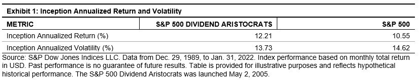
Since December 1989, the index has outperformed the S&P 500 with lower volatility.

Inception Annualized Return and Volatility

Higher-Quality Companies

With looming inflation concerns and the prospect of further volatility, the case for dividend growth strategies may be particularly compelling. The ability to consistently grow dividends every year through different economic environments can be an indication of financial strength and discipline.

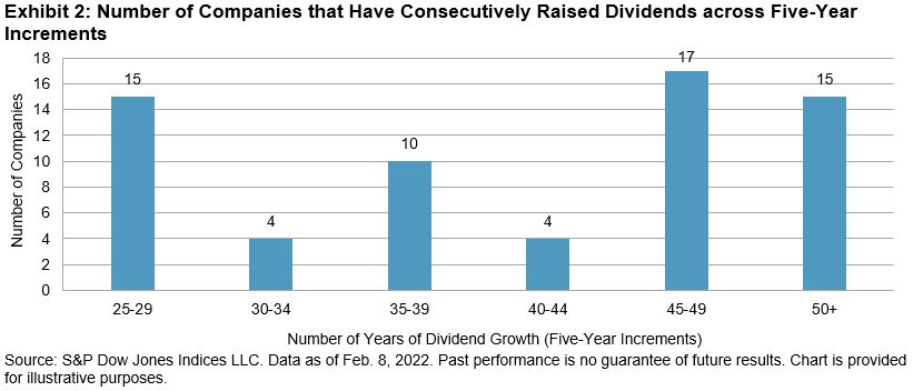
As Exhibit 2 shows, over half of the current constituents in the S&P 500 Dividend Aristocrats have grown their dividends for more than 40 years.

Number of Companies that Have Consecutively Raised Dividends across Five-Year Increments

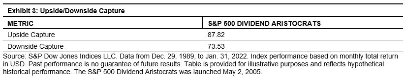
The defensive qualities of the S&P 500 Dividend Aristocrats can be observed by examining the historical downside capture ratio in Exhibit 3. A downside capture ratio of less than 100 indicates that a strategy has lost less than its benchmark during months when the benchmark return was negative.

Upside/Downside Capture

Inflation Protection

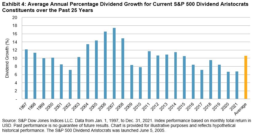
Inflation is the enemy of bonds because it erodes the value of their fixed coupons. However, companies have the advantage of being able to grow their dividends to outperform inflation over the long term. Exhibit 4 shows that dividends paid by current constituents of the S&P 500 Dividend Aristocrats have grown on average by 10.6% a year over the last 25 years compared with ~2.25% per year for inflation.

Average Annual Percentage Dividend Growth for Current S&P 500 Dividend Aristocrats Constituents over the Past 25 Years

Attractive Yield Potential

While potential rate hikes may make equities less attractive on a yield basis, dividends can still play an important role in generating yield if interest rates remain low on an absolute basis.

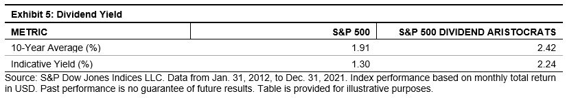
While other higher-yielding dividend strategies exist, they often come with higher risk. The S&P 500 Dividend Aristocrats, however, tend to exhibit lower risk by including only companies that have increased dividends for at least 25 consecutive years, while still delivering higher yields than the benchmark. As of year-end 2021, the S&P 500 Dividend Aristocrats had an indicative yield of 2.24% versus 1.30% for the S&P 500 (see Exhibit 5).

Dividend Yield

Risk Control

Market participants looking to further reduce risk and drawdowns may want to consider risk control strategies. These strategies dynamically adjust exposure to an index, such as the S&P 500 Dividend Aristocrats, in an effort to target a stable level of volatility in all market environments. When volatility increases, the risk control index moves out of the underlying index and into cash. The opposite occurs when volatility decreases.

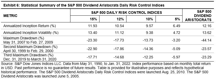
Exhibit 6 shows a detailed risk/return comparison of the S&P 500 Aristocrats Daily Risk Control Indices from May 31, 1990, to Jan. 31, 2022. The three largest drawdowns were dramatically reduced across all four volatility targets.

Statistical Summary of the S&P 500 Dividend Aristocrats Daily Risk Control Indices

With inflation and uncertainty in the air, dividend growth strategies offer a way to measure higher-quality companies, growing dividends, and competitive yields. Market participants looking to layer on additional protection against volatility may also want to consider risk control strategies.

The posts on this blog are opinions, not advice. Please read our Disclaimers.

Altcoins and Indices - Announcing Two Equal-Weight Indices Covering Largest Coins

Contributor Image
Sharon Liebowitz

Former Head of Innovation

S&P Dow Jones Indices

In the rapidly evolving world of cryptocurrencies, one area that is getting a lot of attention is altcoins (or alternative coins). Generally, altcoins refer to cryptocurrencies other than Bitcoin. There are thousands of distinct cryptocurrencies that offer a wide variety of exposures. For instance, altcoins power decentralized finance (DeFi), infrastructure, gaming, the metaverse,1 and more. With cryptocurrencies, it’s especially important to understand what a particular coin does, as well as its associated risks, rewards, and other features. At S&P DJI, we offer a variety of cryptocurrency indices of varying coin capitalization ranges and other characteristics.

To that end, we’re excited to announce the launch of two new indices in our cryptocurrency series—the S&P Cryptocurrency Top 5 Equal Weight Index and the S&P Cryptocurrency Top 10 Equal Weight Index. These indices are designed to measure the performance of the largest 5 and 10 cryptocurrencies by market capitalization. They also differentiate themselves with two key criteria: 1) providing substantial exposure to altcoins due to being equally weighted and 2) enhancing investability by requiring all coins to be held by at least two institutional grade custodians.

Equal-weight indices give the same exposure to each constituent, regardless of size. This is notable because Bitcoin and Ethereum dominate the marketplace with approximately 60% of total market capitalization (as of January 2022). It’s worth noting that this number has decreased from about 80% one year ago—showing both growth of the overall market and the next tier of coins. In a market-cap-weighted top 10 index, once Bitcoin and Ethereum are included, exposure would be limited for the next 8 coins. By contrast, in an equally weighted index, all constituents receive a fixed weight—10% each in a 10-coin index at each rebalance. This provides much more exposure to the next cohort of coins.

With respect to the custodian screen, we have included this to address the many challenges of cryptocurrency custody. We have touched on some of these in an earlier blog. By screening coins for custodians meeting certain criteria, we are measuring a set of coins that might have more utility for an institutional audience that may appreciate added safeguards around evolving technology—mitigating risks like hacks, lost private keys, access difficulties, etc. To that end, many banks and asset managers are integrating with digitally native third-party custodians—that is, firms created specifically to service blockchain infrastructure.

As part of the index methodology, each constituent coin must be covered by a minimum of two custodians that demonstrate both appropriate technology security (either multi-party computing [MPC] or MultiSig) and information security standards (defined by SOC II or ISO27001). Appropriate custody makes it easier for asset managers to hold and invest in the coins.

For S&P DJI, these new indices represent one more way to bring transparency to this emerging asset class. Stay tuned for additional crypto indices launching soon!


1 “The metaverse is a digital reality that combines aspects of social media, online gaming, augmented reality (AR), virtual reality (VR), and cryptocurrencies to allow users to interact virtually. Augmented reality overlays visual elements, sound, and other sensory input onto real-world settings to enhance the user experience.” (Source: Investopedia, https://www.investopedia.com/metaverse-definition-5206578.)


S&P DJI relies on reporting from its cryptocurrency pricing provider, Lukka, Inc. for custodial screens. For more information about Lukka, please refer to the website: https://data.lukka.tech/prime/. S&P Global, Inc., the parent of S&P Dow Jones Indices LLC, is an investor in Lukka. For information on S&P Global’s investment in Lukka, please see here. In addition, representatives of Lukka may provide consultative services to the S&P Digital Assets Index Committee from time to time.

For more information on the indices, please see the methodology for the S&P Cryptocurrency Top 5 Equal Weight Index and the S&P Cryptocurrency Top 10 Equal Weight Index.

The posts on this blog are opinions, not advice. Please read our Disclaimers.

U.S. Equities’ Resilient Run

Contributor Image
Fei Wang

Senior Analyst, U.S. Equity Indices

S&P Dow Jones Indices

It has been a tricky start to 2022, with drawdowns in many segments of the equity markets. Stocks have experienced divergent performances amid varied earnings announcements, a surging energy complex, geopolitical risks, and expectations for interest rate hikes from the U.S. Federal Reserve. Though far from the same magnitude, recent returns have been reminiscent of March 2020. Indeed, the 29% monthly difference between the best- and worst-performing S&P 500® sectors in January 2022 was the highest since March 2020. Some market participants may be contemplating portfolio changes in response to recent drawdowns, but others may wish to consider the potential power of doing nothing.

Exhibit 1 shows that the performance of the S&P 500, S&P MidCap 400®, and S&P SmallCap 600®, as well as their equal-weight, sector, and style variations, was resoundingly positive over the three-year period ending Dec. 31, 2021. Although the past three years offered their fair share of sentiment-shifting trends, from the market plunge due to onset of the COVID-19 pandemic, turbulence around the 2020 U.S. presidential election, and the closely watched response from the U.S. Federal Reserve to rising inflation, the S&P 500 posted a whopping 100% total return. Information Technology led the way with a 190% total return, and all but two indices finished with positive returns.

Exhibits 2-4 offer greater context by showing the distributions of three-year rolling annualized returns since June 1995 (Real Estate data goes back to 2016, when it became a standalone GICS sector). The charts show the interquartile range, mean, and median three-year rolling total returns for each index. The whiskers extend to the maximum and minimum values, and the latest returns are annotated as dots. Across the size spectrum, recent returns for most indices were higher than their respective 75th percentiles, with particularly strong returns—by historical standards—coming from a number of S&P 500-based indices.

For example, Exhibit 2 shows that recent three-year returns for the S&P 500 and most of its related indices were well above their long-term averages, except for the Energy, Utilities, and Pure Value indices. By percentile ranking, the S&P 500 (95%), S&P 500 Equal Weight (97%), S&P 500 Materials (99%), S&P 500 Real Estate (100%), and S&P 500 Growth (96%) are all ranked above 95% percentile in their respective history.

Exhibit 3 shows that the recent three-year performance for the S&P MidCap 400 and its related indices were also typically above their historical averages. The S&P MidCap 400 Industrials and Consumer Discretionary sectors posted particularly prominent returns relative to their respective historical returns, ranking in their 98% and 99% percentiles, respectively.

Exhibit 4 tells a similar story for the S&P SmallCap 600 Indices. All but three indices posted above average three-year rolling total returns, with the Information Technology sector’s returns within touching distance of its maximum.

The strong performance across the U.S. equity capitalization spectrum in recent years demonstrates the potential power of tracking the U.S. equities market. Given the challenges of successfully timing the market, some may wish to remember that time in the market could be more important than timing the market.

The posts on this blog are opinions, not advice. Please read our Disclaimers.

Is Fixed Income Failing? It May Be Time to Look at the Index

Contributor Image
Brian Luke

Senior Director, Head of Commodities, Real & Digital Assets

S&P Dow Jones Indices

Last year wasn’t the best time to hold bonds. Nearly every equity market delivered solid gains in 2021, while the S&P U.S. Aggregate Bond Index fell 1.4%. Nevertheless, flows into fixed income products such as ETFs were firmly positive. The leading asset gatherer was total market-type ETFs, with one in every three dollars newly invested in U.S. fixed income ETFs during 2021 allocated to the “aggregate” category.

This is perhaps unfortunate, as the “aggregate” bond indices largely excluded some of the best-performing segments last year, as Exhibit 1 shows. This anomaly isn’t new, but it is newly causing providers to openly question the traditional thinking of fixed income indexing.

Fixed income investors have long measured the bond market with an aggregate-type index. As the name would imply, the largest portions of the bond market are combined into a single index. In simpler times, this worked: the majority of the bond market consisted of Treasury, government agency, corporate, and collateralized bonds. However, newer segments that are designed to protect investors from inflation (TIPS), interest rate risk (duration hedged and floating rate bonds), and taxes (munis) are excluded. These newer segments, including inflation-linked, high-yield, and global U.S. dollar bonds, have grown in size and scale over the past decades. Nowadays, a typical U.S. aggregate index accounts for only about half of the U.S. bond market, as reported by SIFMA.

Making an analogy to equities, this is akin to excluding stocks because they operate in breakthrough industries that didn’t exist 20 years ago. And, just as avoiding new equity industries can impair performance, last year, the half of the market tracked by aggregate bond indices happened to represent the worst-performing portions of the bond market (see Exhibit 1).

Investment managers, particularly those managing active funds, have moved beyond these core holdings to create “core-plus” accounts. These strategies allow for flexibility to buy non-aggregate securities like inflation-linked and high-yield bonds. Allowing for out-of-index trades opens up the opportunity set but, with the benchmark still anchored to its old rules, a potential mismatch arises in performance evaluation and risk management.

The practice of measuring managers’ performance against core and core-plus categories is recent, yet roughly half of active bond managers are placed in the category. This schism in the largest fixed income category has taken place in the mutual fund world, while the largely passive ETFs have remained anchored to the old index ways. Yet, investment flows into active fixed income ETFs, while small, are double that seen in the equity market (see Exhibit 2). This could be partly due to the flexibility active managers enjoy, as well as the gaps in traditional fixed income benchmarks. Readers of our blog should know better, though. According to our latest SPIVA® U.S. Scorecard, which measures performance of active managers against their benchmarks, the majority of fixed income managers failed to beat their assigned benchmarks in the 3-, 5-, and 10-year horizons.

Despite their long-term underperformance, the past year has been favorable to the large majority of active fixed income managers, at least if their performance is to be compared to traditional aggregate indices.

But traditional aggregate indices may, like their active alternatives, benefit from casting a wider net. As they do, passive bond funds could move to incorporate rules-based, systematic, and transparent return-enhancing bond strategies, such as inflation protection, credit premia capture, and curve strategies (such as carry, roll, and yield enhancement). For that to happen in indices, a new breed of index may be required, and the timing for that solution looks promising.

The posts on this blog are opinions, not advice. Please read our Disclaimers.

Value Resurgent

Contributor Image
Craig Lazzara

Former Managing Director, Index Investment Strategy

S&P Dow Jones Indices

This year marks the 30th anniversary of the launch of indices designed to distinguish growth and value investment styles. Investment managers had classified themselves as growth or value specialists (among other possible differentiators) before 1992, but until then it wasn’t possible to evaluate a value manager against a systematically defined value benchmark or a growth manager against a growth benchmark. (Such comparisons have not generally been happy ones for active managers, but that’s a story for another day.) As with the S&P 500®, style indices, used initially as benchmarks, also came to underlie investment products by which growth and value exposure could be indicized.

Exhibit 1 compares the performance of the S&P 500 Growth Index and the S&P 500 Value Index. When the line on the graph is rising, Growth is outperforming Value, and vice versa when the line is falling.

Growth has outperformed since 1995, although it’s obvious that leadership has shifted between the two styles periodically. Given that the last 10 years have been largely dominated by Growth, and given the historical tendency for leadership to rotate, it’s not surprising that many market participants wonder when Value will once again take the lead. It has been a frustrating wait.

I confess that I am among the frustrated. Observing that between September 2020 and May 2021 Value (up 31.6%) had outperformed Growth (up 14.2%), I brazenly suggested that perhaps the long-awaited turn had come. My temerity was rewarded by a six-month streak in which Growth outperformed Value in five months. (The final score was Growth 19.1%, Value -0.8%.)

But since the beginning of December 2021, Value has once again assumed the lead. For the last two months, S&P 500 Value has scored a total return of 5.3%, while S&P 500 Growth has lost 6.1%. As Exhibit 2 makes clear, Value has dominated Growth across the capitalization range.

Most style index series are designed so that growth and value together compose the parent index; this necessitates their holding some stocks that are not obviously in either the growth or value camp. For clients who prefer a more concentrated approach to style, the S&P 500 Pure Value Index includes only names with the highest value scores, and analogously for the S&P 500 Pure Growth Index. Historically, when Value is outperforming Growth, typically Pure Value is outperforming Pure Growth by more, and Exhibit 3 shows that this pattern has continued during Value’s recent recovery.

Of course, we don’t know how long Value’s dominance will last—the historical record has included periods as short as six months (March-August 2009) and as long as 50 months (April 2003-May 2007). Owners of value indices obviously hope for the latter outcome, but even the former leaves room for additional outperformance.


The posts on this blog are opinions, not advice. Please read our Disclaimers.